About us!
 I’m Oscar. I’ve been involved with the newspaper since I was a freshman. But in around second grade, I started getting more into doodling. I would pick out drawing guides at my library and start making Pokémon drawings and painted bookmarks for my friends. As passion grew, my parents would buy me art supplies. Art since then has always been a form of release and with a little bit of time and patience, a way to connect with others with something more personal.
 Hi! I’m Anni —or Kristine, however you know me. I became an editor for A & C my junior year, but I have been submitting since my sophomore year. You might have seen my art in other school publications, or are seeing it now for the first time. I used to draw realism and use colored pencils, and I still have that skill set, but I have since switched to digital art for its convenience and animation programs. I am drawn to contrasting palates, my pieces are either really colorful, boarding eye-strain, or monotone. My art is very much an outlet for me to express an idea or feeling in an image.
Join us as we explain our art process!
Inspiration
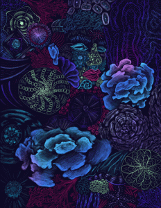
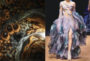 Oscar: I’ve always had a deep connection with marine life, so I wanted to pay homage to that. However, I didn’t want to be so obvious about it and focus on subjects we are all so familiar with. I remember this art installation by Claudia Bueno, Pulse, who used painted spirals and branches reminiscent of aquatic life on glass panes which came to life when put under a moving light. I was also inspired by the forms that designer Iris van Herpen had used in her fashion collection Sensory Seas.
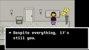
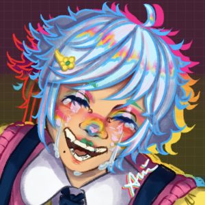
Anni: I have had a difficult battle with my self-image for a long time. I’m always fighting with my identity, like a perpetual tug-of-war that might end in the rope snapping. In order to combat this, I experiment with different expressions of myself. The one that sticks with me the most is a clown. Clowns are often the butt of the joke, a spectacle, all they can do is stand there in an attempt to make people laugh. But clowns are also colorful and fun, bright and cheery. Clowns are silly for the sake of being silly. Another mechanism I use to combat my feelings are video games. In this specific piece, I reference Undertale by Toby Fox, and Omori by Omocat. I insert myself into fantastical worlds and realize that, at the end of the day, I am still me. That behind the screen, and the makeup, I am just myself. I wanted to incorporate those ideas into my piece.
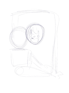
The Sketch
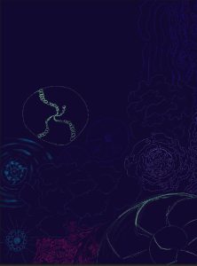
Oscar: Using reference images from different species of plankton, corals, and shells, I began just by doodling different shapes. I tried a multitude of different patterns of varying sizes. Working my way to the center, I referenced my own face to format some patterns that had much more intention.
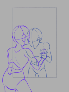
Anni: I used references for a bathroom mirror and sink. I also used a face reference of myself in clown makeup. The rest was all from my imagination. I have a pretty good understanding of anatomy, so at this stage, it is haphazardly done with little indication to anyone but myself to what I am drawing.
Foundation
 Oscar: Since this was an experimental process, I just decided to play around with colors. I knew that I wanted to keep a neon color scheme to offset the deep blue-purple at the back. I figured to focus on blues, purples, and greens for the most part, and using a much warmer color like magenta would stand out much more than before.
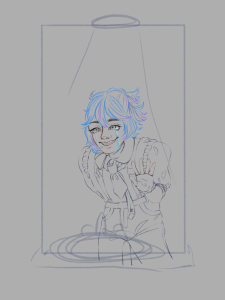
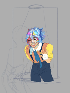
Anni: I start with the subject of my piece, the clown, and start doing linework. This is when I design and finalize facial features, posing, clothing, and lighting. These factors determine the thickness of the pencil I use and how prominent certain features have to be. After this, I use the fill tool to apply flat color to my piece, blocking out how the final image will look after rendering.
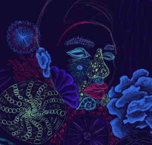
Details & Rendering
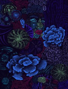
 Oscar: I was debating how much fine detail I was going to put in. I decided to leave a rough look and not use clear defined pen lines. I didn’t color all the way through since I wanted to take advantage of the negative space which helped maintain the bioluminescent look. For small particles, I used fine lines but for pieces that fanned out, I used much broader strokes.
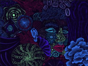
Anni: The rendering stage always takes the longest. I identify my pre-planned sources of light and shade the subject accordingly. I tend to shade with a whole range of colors —as opposed to a set palette— and with as saturated of a palette as possible, using the lightest color on the color wheel, yellow, for highlights, and the darkest, blues and indigos, for shadows. When my subject is finished, I work on the foreground, what’s in front of the subject, as opposed to the background, what is behind the subject. This particular piece utilized the foreground to create a mirror effect, making it so that there was no use for a background. All of the parts of my pieces that are not the subject remain lineless. Inspired by animation techniques, I only outline my subject to keep it as the most prominent part of the piece.
Animation
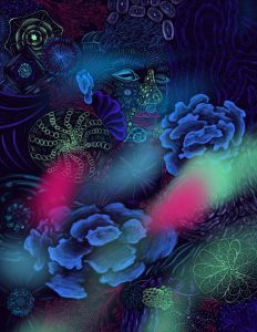
 Oscar: At some point, I went to the Monterey Bay Aquarium where there was this light show which was amazing. It exhibited the beauty of the organisms glowing in the deep sea with small flashes and long trails. I then decided to make the piece glow even more and for it to feel like waves of energy were moving through.
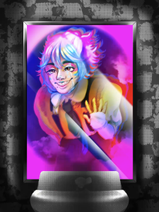
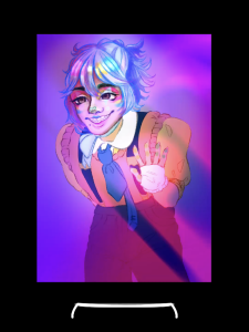
Anni: I wanted the face of my subject to look as if it was glowing. That the expression is happy and bright, yet tears still stream down their face. Tears that shine as bright as the sun.
Finished Piece